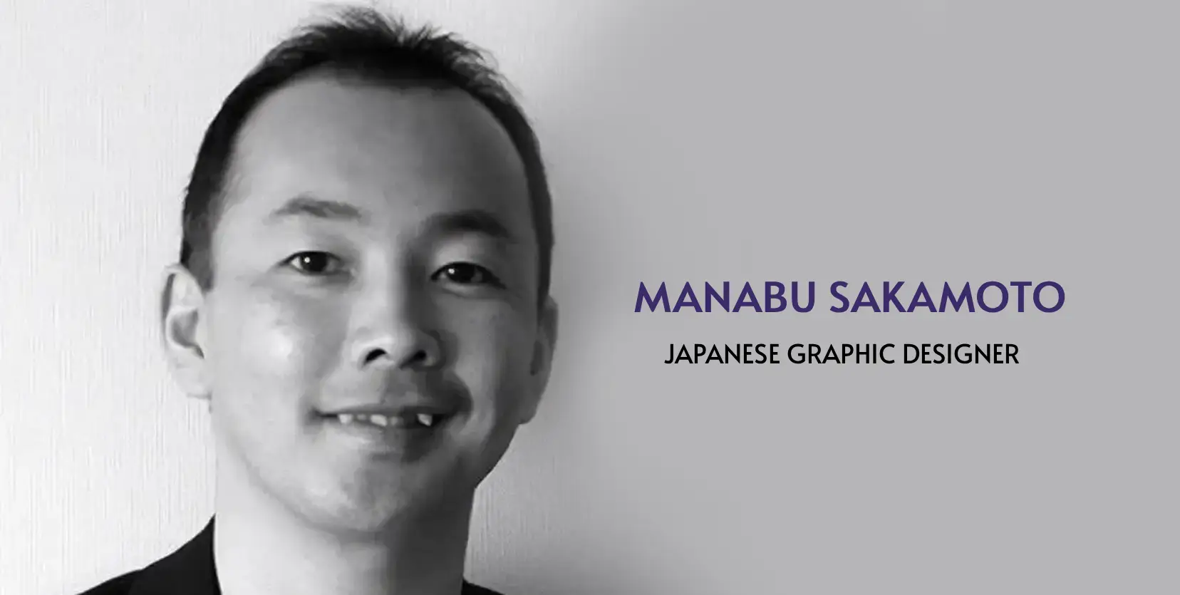
In 1994, a graphic designer working for Sony sat down with a blank canvas, a gaming console brief and a challenge that most designers secretly dread: make something that has never existed before for a product that the world doesn’t yet understand. He was called Manabu Sakamoto. And what he came up with was one of the most recognizable logos in the history of mankind – the PlayStation Logo.
The PlayStation logo story isn’t just a piece of gaming trivia for business owners and gamers. It’s a masterclass in how intentional, strategic design can elevate a product to a cultural institution— and why your logo deserves so much more thought than most businesses give it.
“A logo isn’t decoration. It’s the first sentence of your brand story — and it either earns attention or loses it in under a second.”
The man behind the PlayStation Logo
Manabu Sakamoto studied Visual Transmission Design at the University of Tsukuba before joining Sony’s Creative Development Department in the early 1990s. He was already well-versed in brand identity — his fingerprints are also on the VAIO logo — but PlayStation was a different kind of brief entirely. Sony was entering an uncharted market, targeting young, diverse audiences with a console capable of something genuinely new: real-time 3D graphics.
The logo needed to say all of that without using a single word.
Twenty drafts before greatness
Sakamoto didn’t arrive at the iconic PS mark on his first attempt. He developed approximately 20 prototype designs, cycling through different forms, weights, and compositions before landing on the final version. That process tells us something critical: great logos are not lucky accidents. They are the result of rigorous iteration guided by intent.

His method was 70% concept ideation — rooted in keywords like “inspiration” and “logic” — and 30% refined execution. He wasn’t just sketching shapes; he was translating brand values into geometry.
The design itself: more than letters
The final mark features an interlocking “P” standing upright over a horizontal “S”, creating a perspective-distorted optical illusion of depth — a 3D shadow effect that seems to float. In 1994, when every competitor was working in flat 2D pixel art, this was a radical visual statement. The logo literally embodied the console’s greatest technical achievement before anyone had even switched it on.
The four colours were equally deliberate:
30 years and the PlayStation Logo is still going
The PS5 logo is desaturated, stripped back to monochrome. Yet it is unmistakably PlayStation. That is the hallmark of a logo built on a strong structural foundation: it can evolve without losing its identity. The core mark has endured through six console generations, hundreds of millions of units sold, and a shift from physical shelves to digital storefronts. It didn’t survive by chance. It survived because Sakamoto designed for longevity, not just the moment.
![]()
“The best logos don’t just look good today. They are built to carry meaning forward — even as everything around them changes.”
The PlayStation logo turned a gaming console into a cultural landmark. It didn’t do that with a big budget or a flashy agency campaign. It did it because one designer sat down, took the brief seriously, and asked the right questions before picking up a pencil. So you don’t need a Sony-sized budget to apply these principles. Whether you’re a small startup in Nairobi, an established SME, or a growing regional brand, the oncepts from the PlayStation logo are universally applicable.
Your logo has the same potential. The only question is; are you giving it the same level of thought? Here what you need to know about why you need a professional logo as a business.
Next on, we’re looking at another iconic logo or brands with a story most people have never heard.